In The Curious Kitchen Rebrand
-
During my second co-op term with Mertz Design Studio, I was given the opportunity to manage a branding project through their LaunchPad program. The task was to design a new logo and package design for the food brand In The Curious Kitchen. With that came the creation of brand guidelines, packaging research, and print testing to bring the project from concept to completion.
-
I began this project with an in depth brand audit, highlighting direct competitors and other brands in the industry. This gave us perspective and understanding of the market on shelf and online. Following that came the logo redesign, brand creation/refresh, and finally the label designs. The biggest goal here was creating an ownable brand with elements unique to the founder’s story. We wanted to keep the traditional southern ties and incorporate intentional, handcrafted touches.
Time For Some Research
-
The first step of this process was to complete a comprehensive (50 pages to be exact) luxury brand audit featuring competitors and the current brand itself. I researched direct in-store and online competitors to see how they present themselves as an elevated food brand. This list included well-known companies like Blackberry Farm and Stonewall Kitchen. I also looked into brands who create a unique system across their products, like Jeni's Ice Cream and Ghia.
For each competitor, I analyzed their logo, label designs for various comparable sku's, as well as their digital, social, eCommerce, and retail presence. I found that overall, in order to come across as elevated and gourmet, the packaging should have custom elements, a recognizable color palette, and be able to tell the brand's story.
-
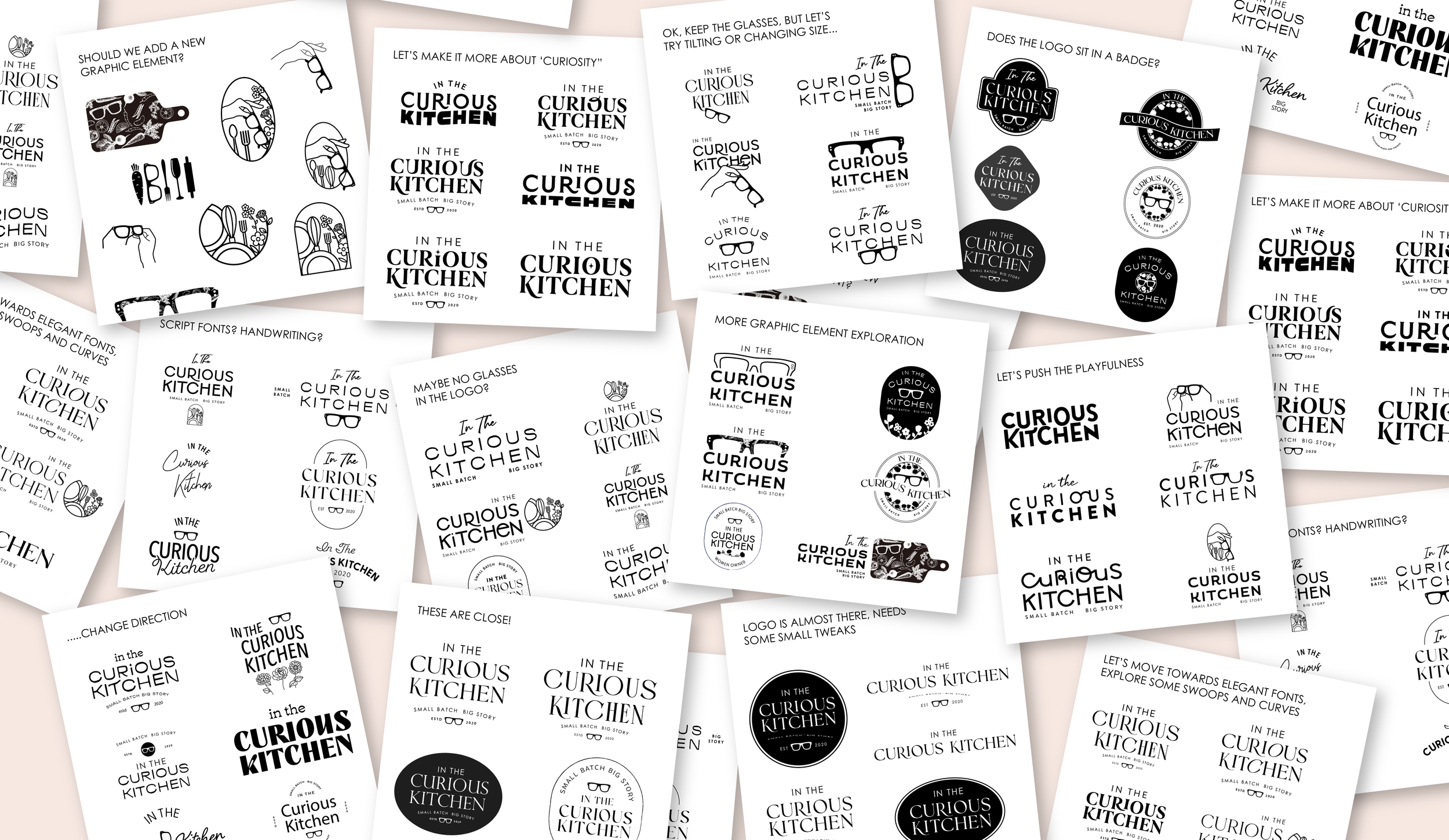
The goal here was to create a logo that feels premium while fitting the southern and handmade story of the brand. I created iterations upon iterations to see what definitely fit the vibe and what did not. After a few rounds of logo presentations, the final one was chosen. I think it perfectly embodies the depth of the founder's story while feeling elegant and southern at the same time.
Let’s Get into the Redesign!
-
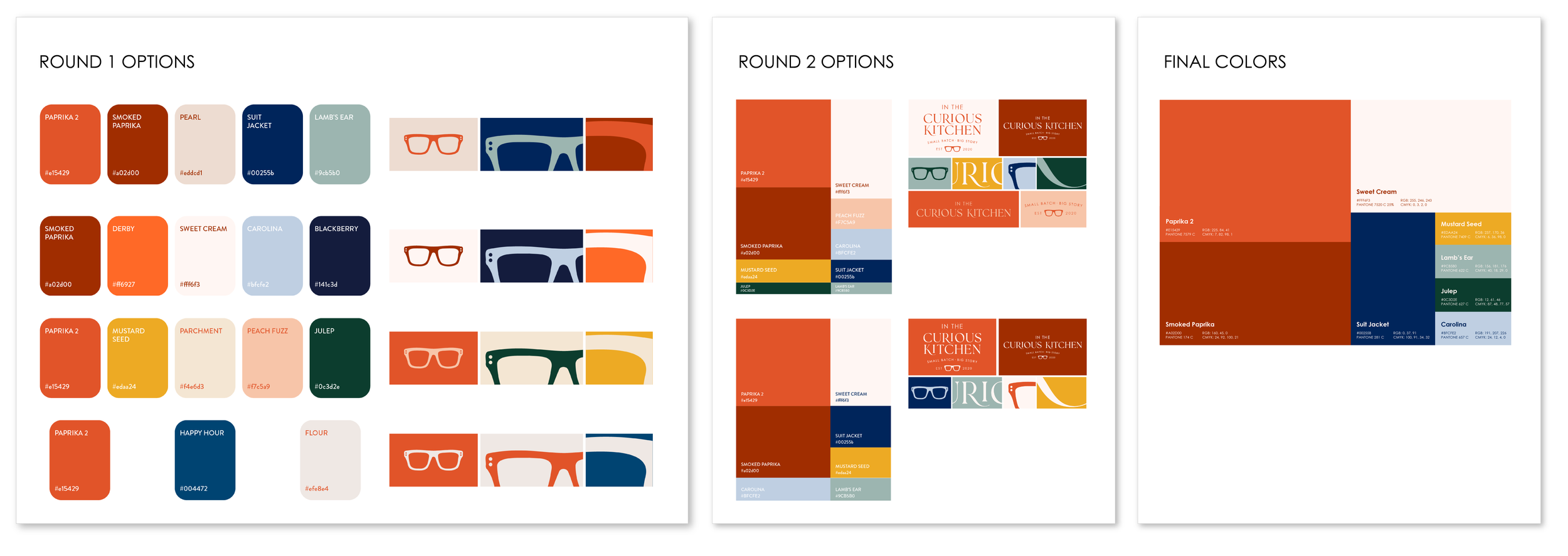
Now that the logo was set, I moved on to create brand guidelines that matched its energy. I knew how iconic the original Paprika color was to the company, and wanted to update that and expand to find colors to compliment it. The final palette is like the original palette, but after a makeover and some newfound pizazz.
The brand fonts were pulled from the logo. They create a sophisticated and polished font pairing.
Now Let’s Refresh the Branding
-
One of the improvements that could be made to the original branding was the graphic elements. These lacked personality and were simply not ownable. I explored three illustration styles, that would bring a handcrafted and unique element to the brand. We considered grainient (grain + gradient) style, a scientific journal style, and a gouache watercolor style. Gouache/watercolor had the most charm and custom feel, so we chose that direction.
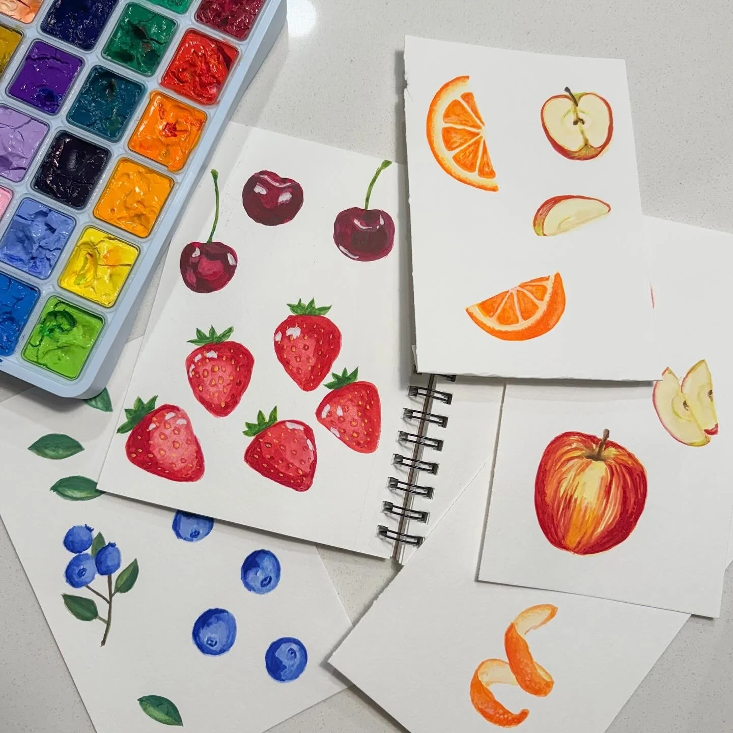
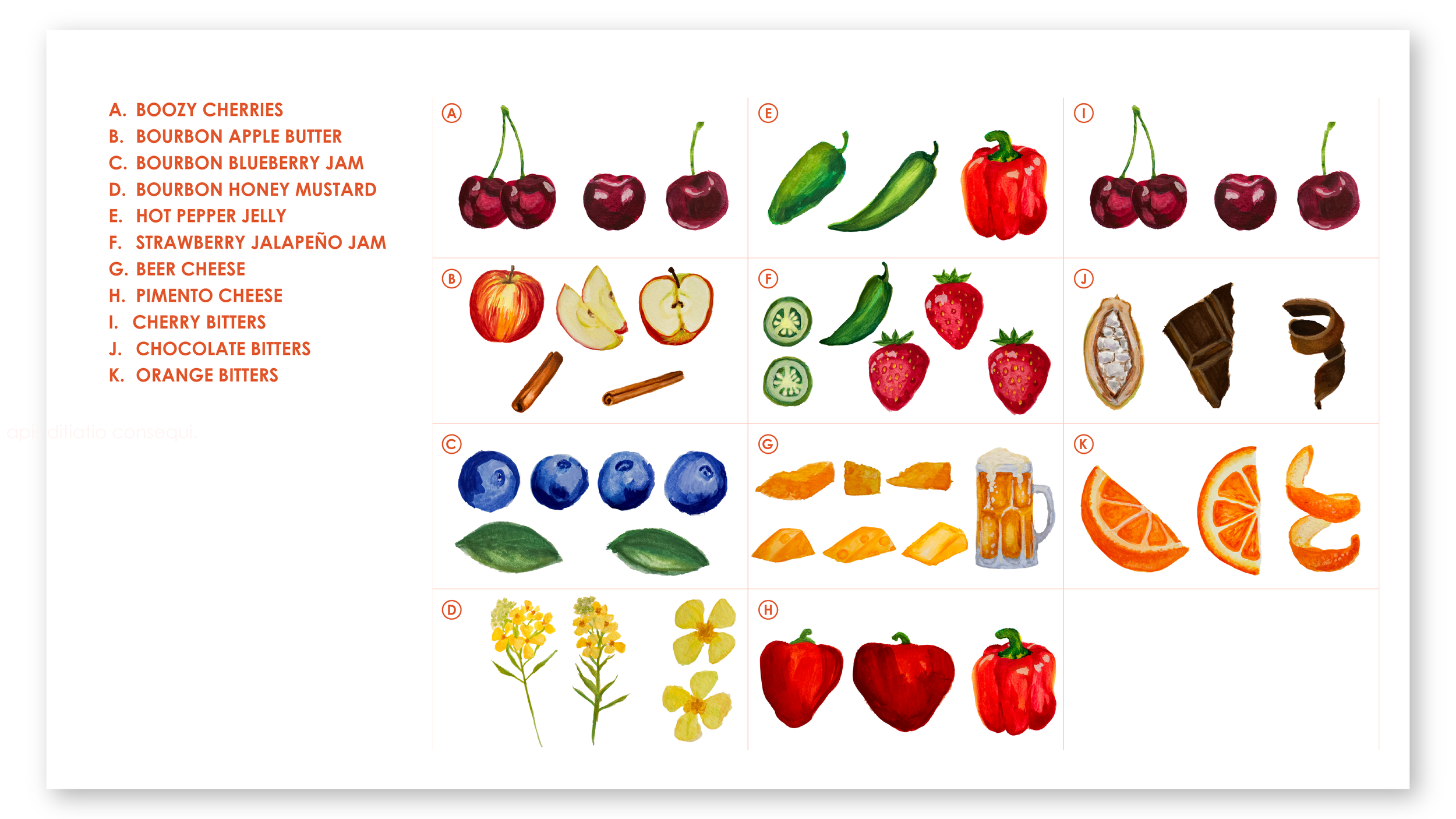
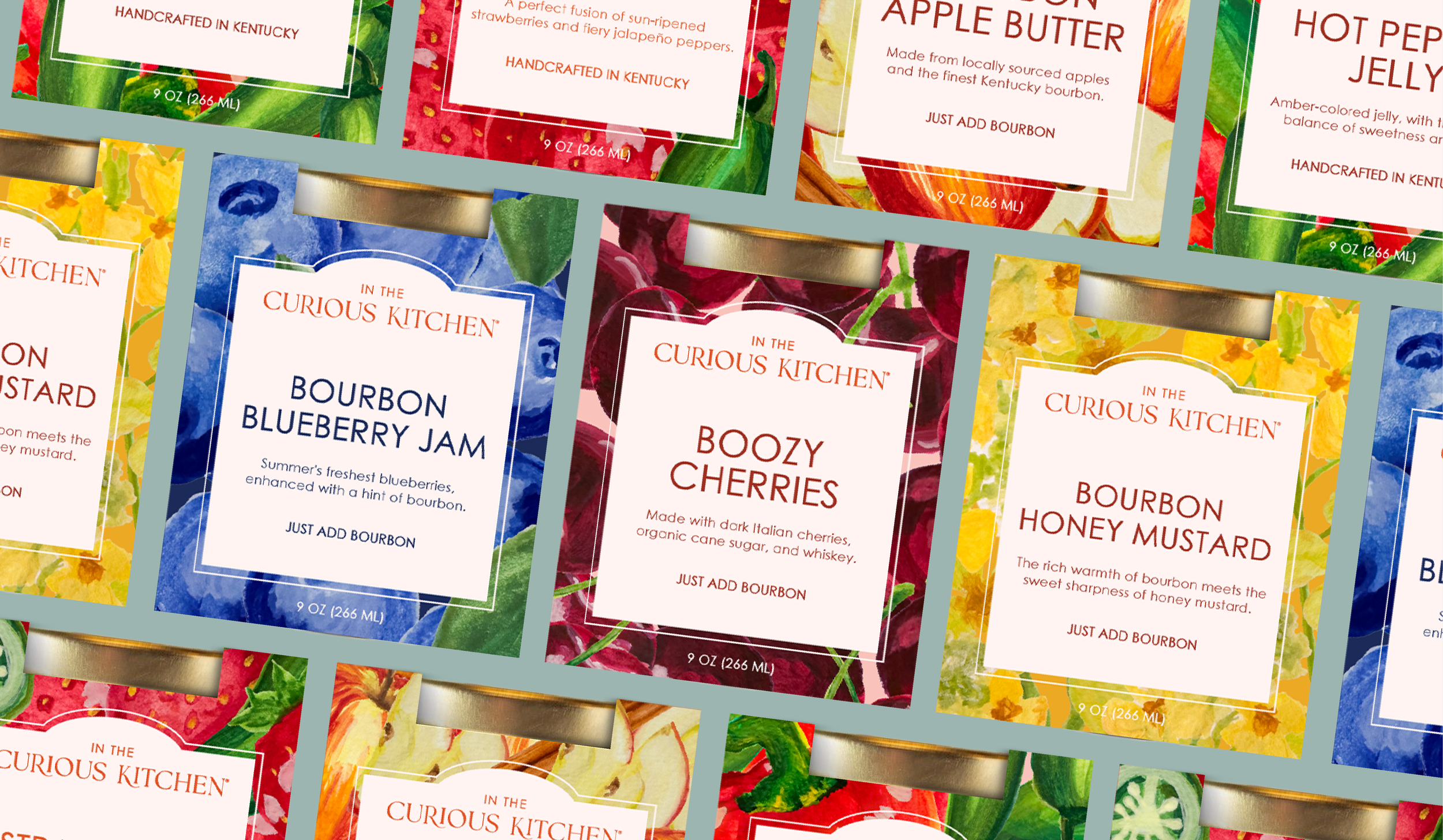
After the gouache style was selected, I dove into visualizing the flavor profiles of each SKU. I hand painted the fruits, spices, vegetables, and other flavors that make up each of her products. The products have such bold and memorable flavors, so the illustrations needed to match that energy!
Custom illustrations take a brand to the next level
-
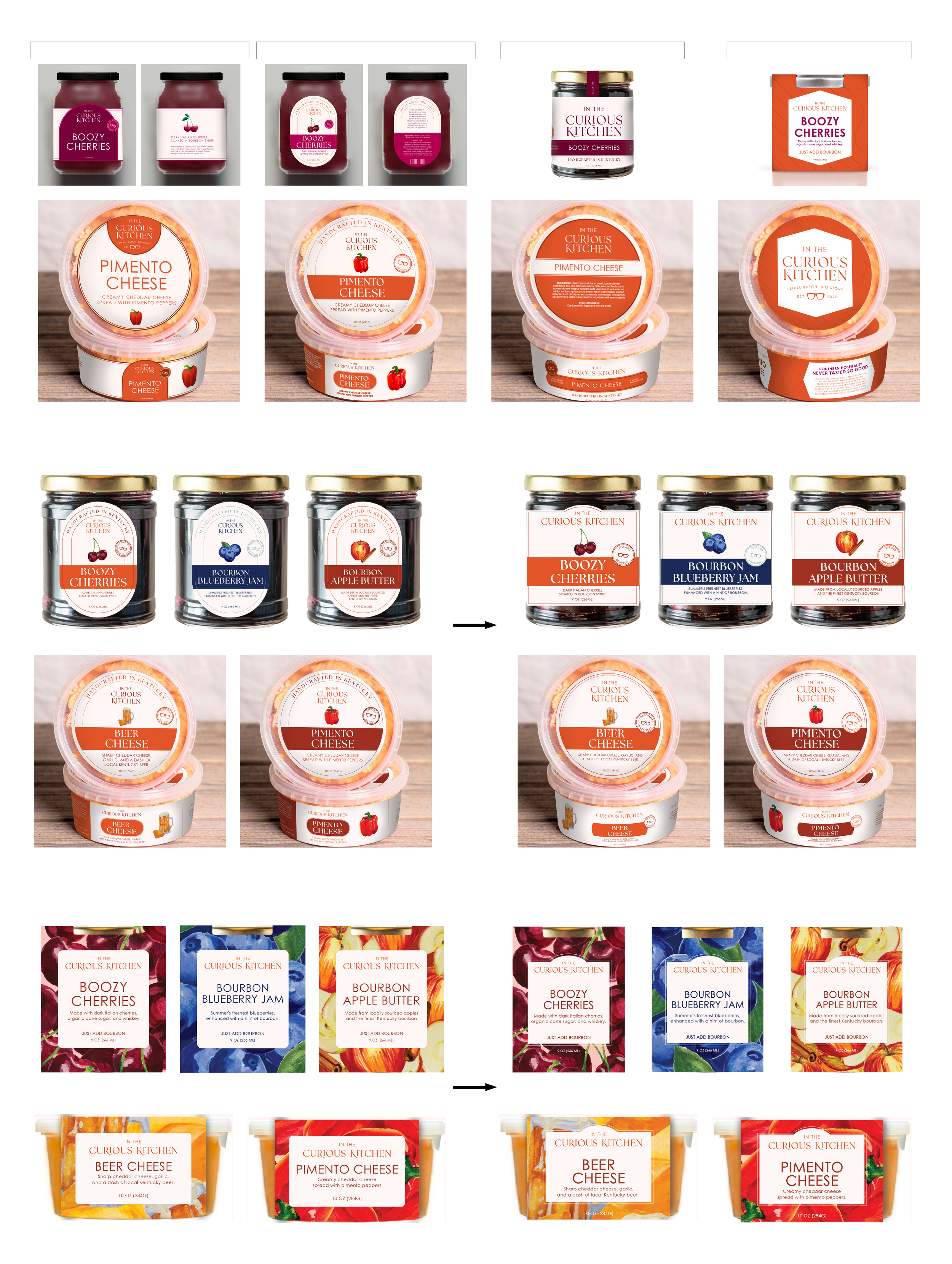
Label design has a huge impact on whether or not a customer wants to buy the product. While being beautiful and eye catching is important, it is equally as important to portray the brand's story and unique qualities. Through this process, I explored many label shapes and designs made of the current label sticker material. There was strength to the labels that had custom dielines and strong use of color, but we felt the packaging form could still improve.
After more online and in store research, I explored the possibility of a paper sleeve to wrap around each product. This further pushes the "giftability" and premium feel of the items. A sleeve wrap worked for two of the components, jar and tub, but not very well for the dropper bottles. I landed on a sticker wrap paired with a booklet tied around the bottle neck. That way the customer still has part of the packaging to open up. Like a gift!


